
What's going on guys, thanks for clicking my post. Just want to say happy Saturday.
I wanted to kind of share my design process behind my latest commission, as it was very fun, and I had put major time in coming up with the actual logo.
Now I have agreed to not disclose what the logo is for, but I can discuss some information that is already available.
The client
The person who actually commissioned me was @jonny-clearwater
Now, @jonny-clearwater is a very interesting fellow who constantly looks for cool ways to engage with the steemit community. I highly recommend you go check out his content, as there is alot of exciting stuff on his blog.
Working with @jonny-clearwater was very easy and painless. He understood my role in the project and valued my input but also gave a lot of feed-back that influenced the final composition. He paid upfront, so that's always a plus in my books, any client willing to pay upfront for design work is very serious about their product. Overall I'd say, please hire me again, and I wish all clients were this easy to work with.
The briefing
The goals were set very clear with this composition.
- The logo needed to be very clear about what it was about
- The logo needed to be up to scratch with modern designing techniques
- Logo needed to be heavily incorporated with the theme. In this case, Hots + Shots + Steemit
- Had to incorporate Peppers
With the brief in hand, I set out to the next step in my designing process.
The Drawing Board
I knew that I had to play with the concepts of peppers shot glasses, and some lettering. So I took to my field notes and started scribbling down some little doodles.
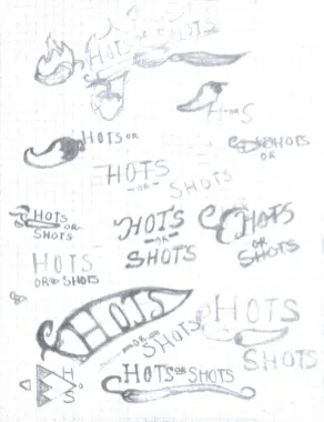
Pretty bad right? I know, but that's field notes for you, it's meant for you to take super messy but fast ideas out of your head, and presents you very wide variety of paths that you can take with your composition. Not really meant to be neat or nice. Just getting the ideas converted from the noodle into a doodle.
Also, I learned that I shouldn't use flash when taking pictures of my sketches.
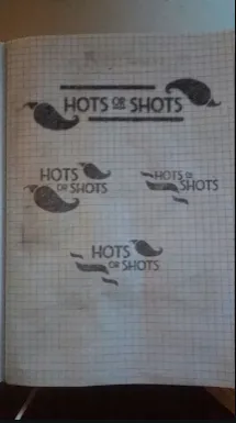
Now this is where I start to get more serious, breaking out my 5b graphite pencil and rulers. From here, I perfected my understanding of how peppers should be drawn. I replicated a premium font that I purchased and did the hand lettering.
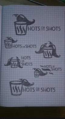
I knew I was getting very close at this point, after finding ways to incorporate the remaining elements into the design. After presenting the sketch drafts, we were able to decide on a design.
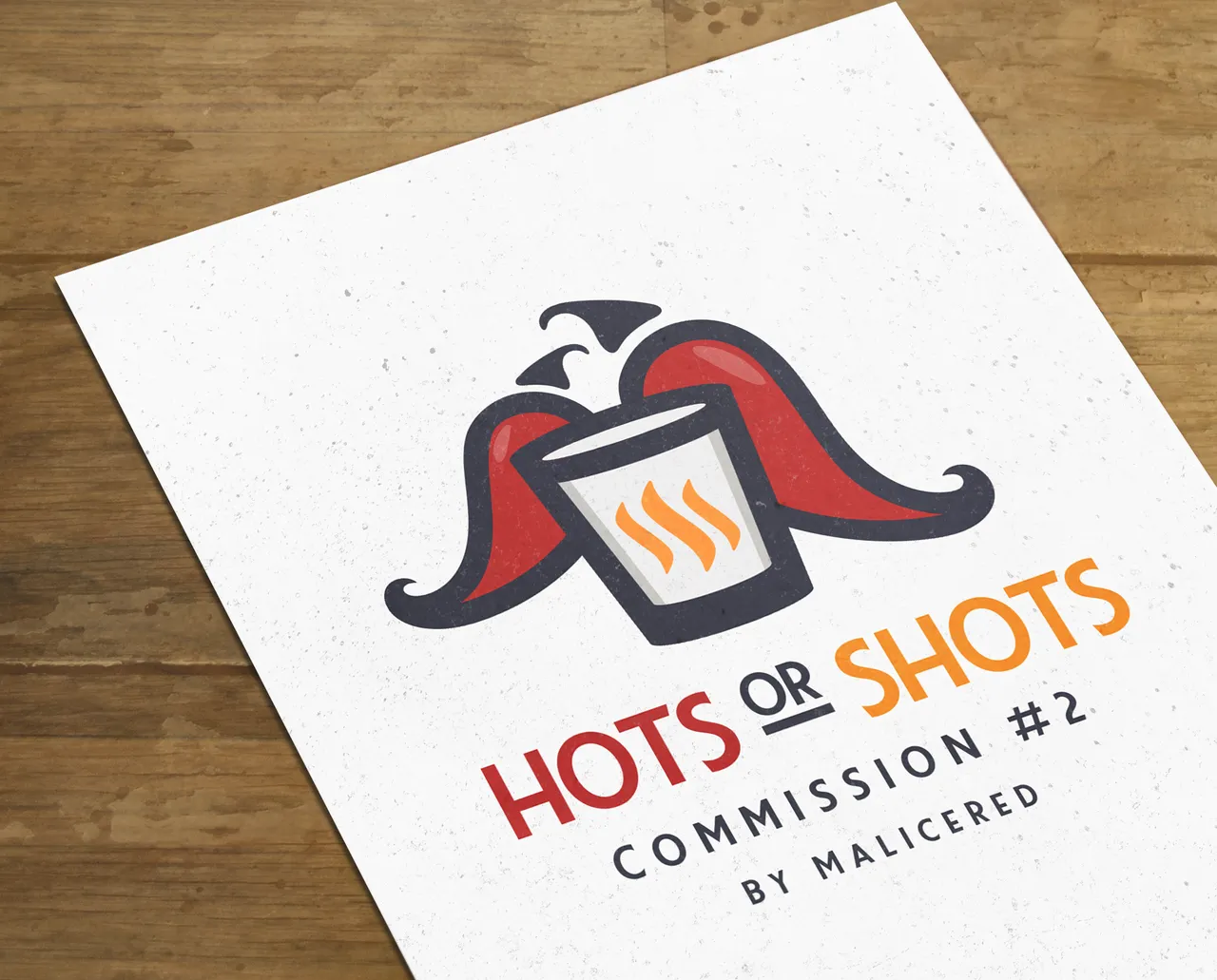
The final
So, after deciding on which best represented the client's project best, I went off to illustrator to work on vectorizing the main conceptual design.

After careful refinement, I've finally put something effective together that brings all the elements that were required, and met the client's goals.
In my humble opinion, I personally thought that this was too cramped of a design, but then again, considering the clients specifications, it has what it needs, and looks great in black and white.
But, we needed to go deeper. We actually needed to get in some color on this composition. It may work well as a watermark if you stripped away the lettering, or might even work around some stationary, but for things like tiny icons, seals, avatars or things like that, it's just way too complicated of a piece. And it's way too unbalanced.

Choose a color scheme that would work for this composition was fairly easy. Hot and shots are very easy concepts to visualize a color for. So, I took those colors, after trying out different color schemes of course. I felt that this was the best color scheme to convey the correct feelings.
Wrapping up this composition, I felt that the logo would be very effective in conveying what the project is about, as it's heavily themed. It won't work as a brandmark however, It's too complicated and busy.
But for what the client is needing the composition for it's going to be very functional for the client. It will work, and the client loves it. So, it's got my seal of approval. It really is a decent logo.
The Value of this logo
Now, there's something that I wanted to bring up. Since I know for a fact that there will be some potential new clients, and startups/businesses that will be reading this.
Based on the amount of time, drafts and ammendments, as well as what the logo would be used for. I'd value this composition at around 600.00 USD. That's how much I would have normally charged if I was in my prime as a freelancer.
Now, I'm sure some of you guys might be looking at my wallet and can put 2 and 2 together. I just want to say, that my pricing was very conditional, and I knew exactly what I was signing up for. Not that I'm complaining about my compensation! I am not complaining about my compensation!
I just wanted to re-affirm the value of design, and don't want people thinking that 25-75 SBD is going to get them a logo like this! So if you're a first time buyer of graphics, particularly a Logo, you're going to be looking at this kind of price range. However, it's a very freemarket, and not all designers charge for the same rates.
Conclusion
Honestly, perfection is an ever fleeting concept. Designing in general is of a very subjective nature. Some people will look at this logo and think it's nothing special, or bad, or any other kind of thing like that. Or, some people could really like it. Design is like that. So rather than basing it on how cool it looks based on a like to not like ratio.
We need to ask ourselves.
Did the design:
- Meet the Client's Goals
- Will be functional to the clients needs
- Incorporate the appropriate elements
- Did the client like it
In this case, yes, the composition meets all of these expectations. To me, the logo looks very clean and professional. I like it. The client likes it, which is an important thing for me, but most of all, I can say it met all goals, incorporated all elements, and it's definitely going to be functional for the client's projects.
This is something I can see featuring on my portfolio.
Also, I do want to give a special thanks @jonny-clearwater.
I am very happy with @jonny-clearwater's agreements and was very happy to work on this project. I'm more excited to see how his project turns out more than anything. And I want to work with him again in the future! Please check out his blog and follow to keep up to date with his content.
And of course, if you guys like this post and want to see more like it, please show me some love by smashing that upovte and resteem button. Every bit counts, and helps me keep the content coming and allows me to work on more steemit related projects. Every upvote and follower pushes me to be a better designer.
Want to hire me? Ask me questions? Or just want to hang out? Join my discord server!
Thank you so much, Love you steemit!!